Some documentation of the Network Visualisation
Tuesday 14th July, 2015

This visualisation shows network congestion for different router settings, as network traffic is increased.
The objective of this visualisaiton is to allow the user to compare different router settings and show their performance over increased load.
It uses a Network Graph, Heatmaps and a Stacked Bar Chart.
Network Graph
Selected Configuration for a selected Injection Rate

The network graph shows the routers, their up/down queue length and occupancy status.
Reading the Network Graph
The backbone routers are stationary, aligned to a pre-existing arrangement. Other routers will self-organise so their parent nodes. The fill color of each node (Figure 3) represents the type of router, as indicated in the "Group" legend of the network graph in the upper left corner (Figure 2).
Hovering over the elements on the legend shows the name of the group to which the colour is assigned.

The stroke colour (outline colour, shown in Figure 4) of the node shows the occupancy status of the router using the selected configuration, at the selected injection rate.
A dark red indicates that the node is cut off from the network, red indicates that it is congested (with a queue length of 124 or greater), and light yellow means that the router is unoccupied.
The two circles inside the node (see Figure 2) represent the current queue length of the router. The upper circle represents the queue up, and the lower represents the queue down. The values are represented by a logarithmic scale from light orange (0) to dark red (1,000,000), as shown by the upper right legend.
The data for any node can be shown by hovering the mouse over the node. This will show a tooltip, and temporarily stops the nodes from moving.
The Tooltip shows:
- Router number, type in parentheses
- Queue length up
- Queue length down
- Occupancy status.

Interaction
In addition than hovering over a node to show its tooltip, the injection rate can be increased or decreased by clicking on the icons in the lower corners of the network graph (Figure 2).
Heatmaps
All Configurations at a Selected Injection Rate
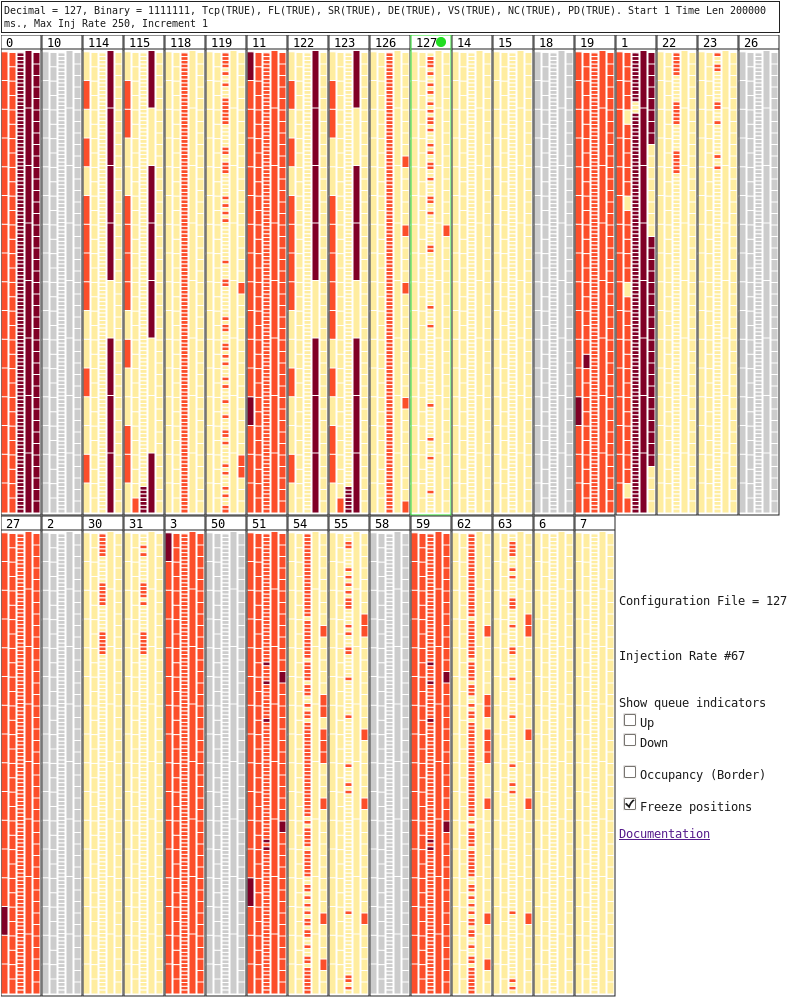
The heatmaps show a comparison of each different confguration at the selected injection rate.
Each configuration has one rectangle for each router in the network. The rectangles are arranged into columns, one for each group, and coloured according to the corresponding router's occupancy status. The configuration shown on the Network Graph is highlighted in green, and a green circle next to the confguration number.
The files that only have grey boxes do no have data for the selected injection rate.
Above the heatmap is the configuration settings for the router.
Figure 5 shows that configuration 127 is selected, and all settings are TRUE. At the current injection rate there are some routers from group 3 (Normal Access) that are congested, and one from group 5 (Fast Access). Configuration 127 shows a similar pattern to configurations 119, 63 and 55.

Interaction
By hovering over a rectangle in the selected configuration (see Figure 6), the corresponding node is indicated on the Network Graph by a green box, and a tooltip shows:
- Router number
- Queue length up
- Queue length down
- Occupancy status.
Settings
Settings for the visualisation are also next to the heatmap.
They are:
- Display of the current Configuration file
- Display of the currently selected Injection Rate as a number, rather than the actual Injection rat (shown on the Stacked Bar Chart)
- Checkboxes to show the queue length up and down indicators on the network nodes.
- Checkbox to show the outline on the network nodes that indicates the occupancy state of the node.
- Checkbox to freeze the position of the nodes in the simulation. When this is checked, the nodes will not move. When unchecked the nodes will move when the mouse moves off a node, and the network tooltip disappears.
Stacked Bar Chart
All Injection Rates for a selected Configuration

The stacked bar chart shows the ratio of unoccupied, congested and cutoff nodes over time, for the selected configuration (Figure 7 shows the Stacked Bar Chart for Configuration 127).
Interaction
Hovering over the Stacked Bar Chart will update the network display. When the mouse leaves the bar chart, the network will return to the last selected Injection Rate, which is indicated by the green line. When hovering, the nearest Injection Rate to the mouse is indicated by a blue line and the corresponding injection rate (see Figure 8). This will not update the Heatmaps, but will update the network graph to show the injection rate indicated by the blue line. Scrubbing along the stacked bar chart will show changes in router states with the increasing traffic.
To update the injection rate shown in the Heatmaps, click on the desired Injection Rate on the Stacked Bar Chart. If the next Injection Rate is desired, the simplest way to select it is using the icons in the lower corners of the Network Graph.

Known Issues
Visualisation
-
Visualisation of 3000 Max. Injection Rate data does not properly select a configuration and timestep when initializing. The user must select these initial conditions. If the user does not do this:
- the tooltips will not work,
- and there may be a mismatch between what sees displayed, and what appears to be selected
- Assigning a fixed location to the 16 backbone routers broke the dragging functionality of nodes. Backbone router nodes cannot be moved, and if the user tries to drag any other node, it will move to location (0, 0) if "Freeze Position" is unchecked.
- Attempting to drag a node unfreezes the network positions.
- Assigning a fixed location to the backbone routers also meant that nodes behave differently, moving a lot more when user moves the mouse off a node.
- As the up/down indicators are drawn last, they may appear above a node that should be over the top of them. SVGs do not have z-indexes (compared to html elements), so this is a bug from d3's drawing procedure.
Preparing Data
The original visualisation files are parsed by a python script. Before this script is run, there are two things to check:
- There must a line break after the value of the "Increment". The first line should be the router settings, and the second should be the headers for the columns below.
- The header "Router ID" needs to be changed to "RouterID"; removing this space will align headers with columns properly. If this is not done, the python script may produce errors.